Calculate Pearson or Spearman correlation for paired data, then compare both methods, inspect a scatter plot, and review R², t-statistic, p-value.
Last updated
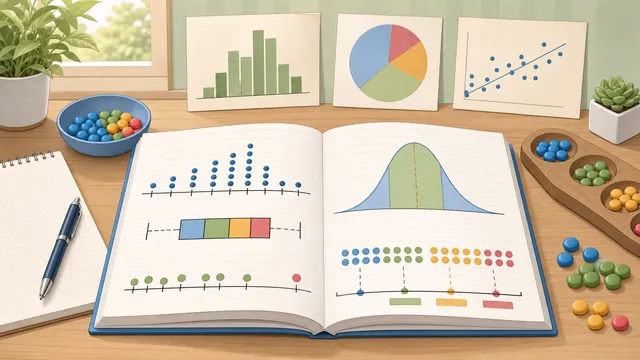
Paired data
Compare paired data with Pearson or Spearman correlation
Pearson is best for linear relationships in the raw values. Spearman is better when the relationship is monotonic but curved, or when ranks matter more than exact spacing.
This calculator reports the correlation coefficient, R², a t-statistic, a two-tailed p-value, and a 95% confidence interval when the sample is large enough.
Quick examples
Pearson and Spearman are the two most common choices. The examples below show both a linear pattern and a curved-but-rank-consistent pattern.
Correlation method
Method guide
Pearson measures linear association in the original values. Spearman converts both columns to ranks first, which makes it more resilient when the relationship is monotonic but not perfectly linear.
If the points curve upward or downward instead of following a straight line, Spearman can preserve the ordering signal even when Pearson looks weaker.
Correlation result
Pearson correlation
1
Very strong positive pearson correlation across the paired values. Statistically significant at the 1% level.
APA-style report: r(8) = 1.00, p < .001, 95% CI [.98, 1.00].
0.99
R²
0
p-value
10
n (pairs)
8
df
−1 (perfect negative)0+1 (perfect positive)
Very strong positive correlation
Result detail
Confidence interval and summary
The 95% confidence interval for this sample is 0.98 to 1.
Correlation summarizes association, not causation. The same coefficient can still be misleading if the pattern curves, if one variable has an outlier, or if the range of values is artificially restricted.
Pearson vs Spearman cross-check
Pearson and Spearman broadly agree
Pearson is 1 and Spearman is 0.98 on the same paired data. When both methods stay close, the main choice is whether you want a linear summary or a rank-order summary.
Scatter plot check
Curve and outlier scan
Use the plot to catch the exact problems a correlation coefficient can hide: curvature, one influential outlier, or an apparent rank trend that is not very linear.
Paired-value preview
Check the first rows before you report the result, especially if you pasted data from a spreadsheet.
Pair
X
Y
1
2
1
2
4
3
3
5
4
4
4
4
5
5
4
6
7
6
7
8
7
8
9
8
Showing the first 8 of 10 paired values.
Coefficient
Pearson r
Direction
Positive
Strength band
Very strong
R² (coefficient of determination)
0.99
t-statistic
28.44
p-value (two-tailed)
0
Degrees of freedom
8
Mean of X
6.6
Mean of Y
5.7
95% confidence interval
0.98 to 1
Reading tip
If the scatter plot is curved rather than straight, switch to Spearman. If you need a prediction line rather than an association summary, move to linear regression after you finish the correlation check.
Correlation calculator — Pearson r, Spearman ρ, and R²
Correlation measures how closely two variables move together. This page also explains the main assumptions behind the correlation calculator — pearson r, spearman ρ, and r² result, highlights the supporting figures shown by the calculator, and helps the reader use the estimate without overstating what a quick online tool can prove.
Pearson versus Spearman
Pearson r measures the strength and direction of a linear relationship in the raw numeric values. Spearman ρ first converts both variables to ranks, then measures how consistently those ranks move together. That makes Spearman a better fit when the relationship is monotonic but not well-described by a straight line.
Both coefficients range from −1 to +1. A value near +1 indicates a strong positive association, a value near −1 indicates a strong negative association, and a value near 0 indicates little directional association in the paired data.
A scatter plot often makes the choice obvious: if the points form a clear line, Pearson is usually the first choice. If the points curve but still rise or fall in order, Spearman often preserves the pattern more cleanly.
R² and the coefficient of determination
R² = r² expresses the proportion of variance in Y that is explained by X. For example, r = 0.8 → R² = 0.64, meaning X explains 64% of the variance in Y. The remaining 36% is attributable to other factors or random variation.
In simple linear regression, R² equals the square of the Pearson correlation. In multiple regression, R² generalises to multiple predictors.
Worked example: same ranks, curved values
Suppose X = 1, 2, 3, 4, 5 and Y = 1, 4, 9, 16, 25. Pearson correlation is high because the values increase together, but it is not perfect because the relationship is curved rather than linear. Spearman correlation is perfect because the ranks line up exactly from smallest to largest in both variables.
That example shows why method choice matters. If the practical question is whether higher X values tend to come with higher Y values in rank order, Spearman is often the clearer answer. If the practical question is whether the relationship is close to a straight line, Pearson is usually the better fit.
Significance testing
To test whether r is significantly different from zero, a t-statistic is computed: t = r√(n−2) / √(1−r²), with df = n − 2. The resulting p-value indicates the probability of observing such a correlation if the population correlation were truly zero.
For Spearman, calculators often apply the same t-based approximation to the ranked data. Statistical significance does not imply practical importance. With a large sample, even a tiny coefficient can be statistically significant, so always consider the size of the relationship alongside the p-value.
A confidence interval gives a range of plausible population values for the correlation. For Pearson, a Fisher z transform is the standard way to approximate a 95% confidence interval; this page reports that interval when the sample is large enough.
A compact APA-style report usually includes the coefficient, degrees of freedom, p-value, and confidence interval. For example: r(8) = .87, p < .001, 95% CI [.53, .97]. Spearman reports often use r_s or ρ to distinguish rank correlation from Pearson r.
Why the scatter plot still matters
A correlation calculator with p value can still mislead you if you never look at the paired points. A single outlier can inflate or suppress Pearson r, a curved monotonic pattern can keep Spearman high while Pearson drops, and a restricted range can make a real relationship look weaker than it is.
That is why this page pairs the coefficient with a scatter plot check and a Pearson-versus-Spearman cross-check. If the two coefficients disagree meaningfully, the next job is not to pick your favourite number. It is to inspect the pattern and decide whether you are looking at a line, a curve, or a ranking effect.
Common mistakes and outliers
A single outlier can pull Pearson correlation far away from the rest of the data. Always inspect a scatter plot before treating the number as the whole story.
Restricted range can also suppress correlation. If the sample covers only a narrow slice of the real values, the observed coefficient can look weaker than the full-population relationship.
Correlation also does not prove causation. Two variables can move together because of a confounder, seasonal pattern, or coincidence rather than because one causes the other.
When to use Kendall's tau or regression
If your data is ordinal, has many ties, or you want a rank-based association measure that is more conservative than Spearman, Kendall's tau is another sensible option. It is not shown in this calculator, but it is often the next method analysts compare.
If your goal is prediction rather than association, move from correlation to linear regression. Correlation describes how strongly the variables move together; regression tries to estimate one variable from the other.
Frequently asked questions
Does a high correlation prove causation?
No. Correlation measures the strength of a linear association but cannot establish causation. A high r could reflect a direct causal relationship, reverse causation, a confounding variable, or coincidence.
What is a good value of r?
Context matters greatly. In physics experiments, r > 0.99 may be expected. In social science research, r = 0.3–0.5 is often considered meaningful. There is no universal threshold.
How many data points do I need?
At least 3 pairs are required (df = 1 for the significance test). For reliable results, n ≥ 20–30 pairs is recommended. With small samples, even spuriously high r values can occur by chance.
Should I use Pearson or Spearman?
Use Pearson when the relationship is approximately linear and you care about the exact spacing of the values. Use Spearman when the values are ranked, the pattern is monotonic but curved, or outliers make Pearson too sensitive.
What does R² mean here?
R² is the square of Pearson r. It tells you how much of the variation in Y is explained by X in a simple linear relationship. If r = 0.80, then R² = 0.64, or 64%.
What is a confidence interval for correlation?
A confidence interval shows a plausible range for the population correlation based on the sample. It is useful because two samples with the same r can have very different uncertainty depending on sample size.
Should I use Kendall's tau instead?
Kendall's tau is a good alternative when the data is ordinal or tied heavily, or when you want a more conservative rank-based association measure. This calculator does not compute Kendall's tau, but it is often the next statistic analysts compare.
Why do Pearson and Spearman sometimes differ so much?
Because they answer slightly different questions. Pearson focuses on how closely the raw values follow a straight-line pattern. Spearman focuses on whether the ranks rise and fall together, even if the shape is curved. A large gap between them often points to curvature, tied values, or one influential outlier.
How do I report correlation in APA format?
A typical APA-style report includes the coefficient, degrees of freedom, p-value, and confidence interval. For Pearson, write r(df) = value. For Spearman, many writers use r_s(df) or ρ(df) to make the rank-based method clear.